Roster is Amazon's internal headcount management tool — used by thousands of engineering managers across AWS and Amazon to track, request, and execute hiring decisions. Millions of dollars in headcount budget flowed through this system every quarter.
Unlike consumer products, Roster sits at the intersection of HR, finance, and operations. Every action a manager takes — approving a req, creating a job post, forecasting hiring timelines — has downstream consequences for budget, cost centers, and org structure.
End-to-end UX lead — discovery through launch. Research, IA, interaction design, design systems, and handoff.
Cross-functional pod: product managers, engineers, data scientists. Led a team of 3 designers.
Internal tooling with no prior design direction. Low adoption at start. High-stakes data accuracy requirements.
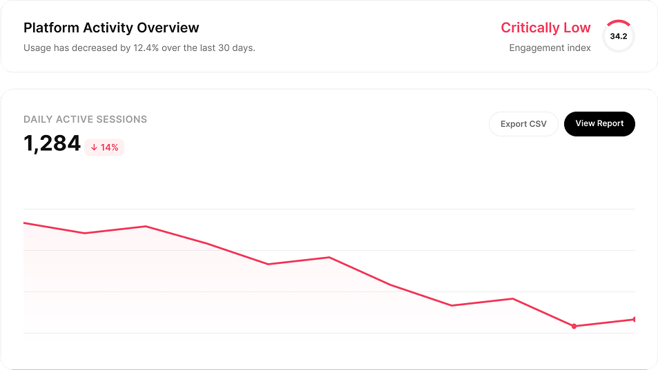
Roster existed, but managers were working around it — in spreadsheets, email threads, and hallway conversations. Adoption was low, the data was unreliable, and headcount decisions were being made without visibility into the real picture.
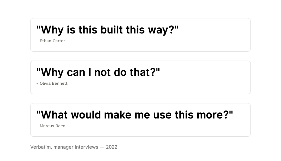
"Why is this built this way?"
"Why can I not do that?"
"What would make me use this more?"
The business consequence was real. When managers can't see their headcount picture clearly, they over-hire. At Amazon's scale, even a small percentage of over-hiring is a significant cost problem.
So the question wasn't just "how do we make this easier to use" — it was "how do we design a tool that managers actually trust enough to make decisions in?" That reframe shaped everything that came after.
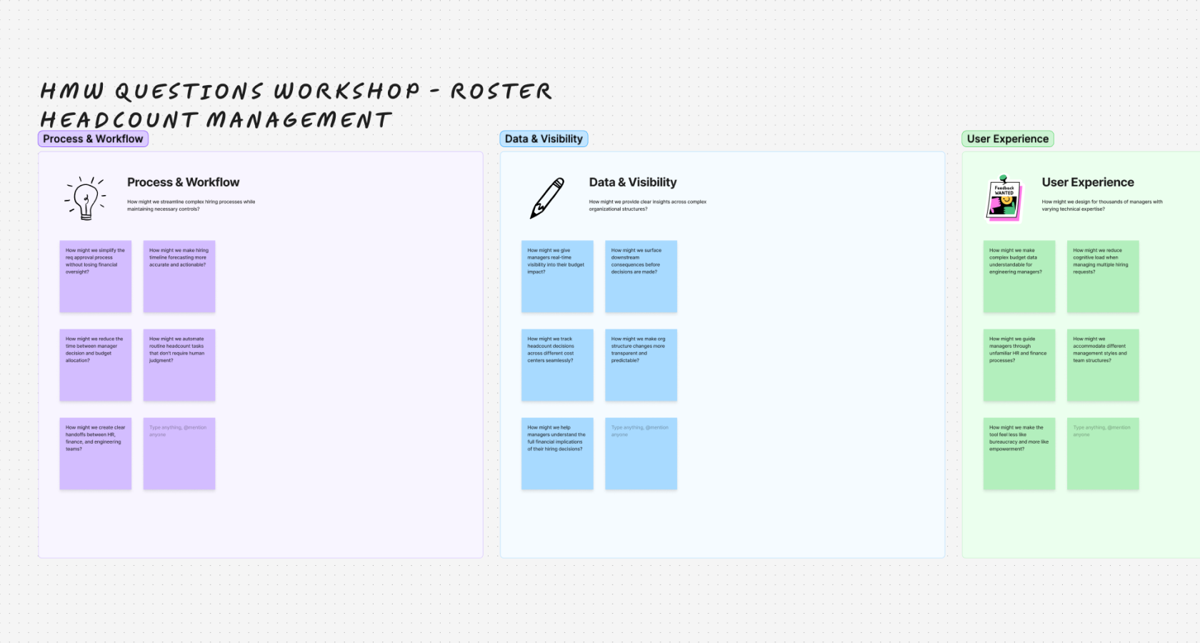
Before any design work started, I facilitated a workshop series to align the cross-functional team — engineers, PMs, and managers all in the room together. The goal wasn't to brainstorm features. It was to get everyone understanding the problem from the same foundation.
We kept coming back to one How Might We: "How might we improve headcount adoption by giving managers a broader, more useful set of tools?" That question became the filter for every design decision in the project.

Three features we thought we wanted to build were killed by a single workshop session. Research revealed managers didn't want more features — they wanted fewer decisions. That finding defined the design direction.
Before design started, the team wrote down what we thought would change behavior. These four shaped the work. Three were tested in an unmoderated study with 12 managers; the fourth was a design decision. Each one changed something on screen.
Managers don’t want more features. They want fewer decisions.
Workshop series, then the 12-participant unmoderated study
Three planned features were cut after a single workshop.
Principle 01: always tell the manager what to do next.
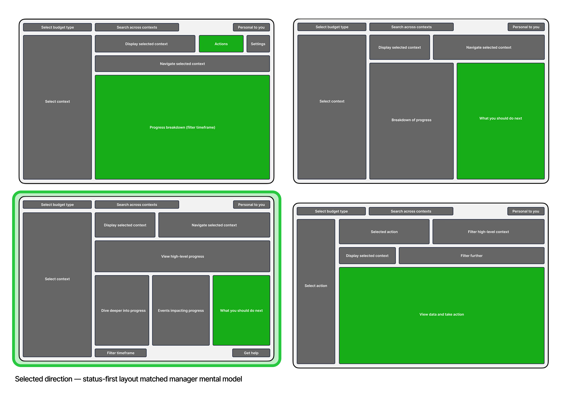
A status-first overview tells managers where they stand faster than a report.
12-participant unmoderated study
Managers read the orange “left to hire” line as “needs attention today,” with no explanation.
Overview built as a status dashboard first, an action surface second.
Pre-filling what the system already knows removes the biggest barrier to creating a job post.
12-participant unmoderated study
A 15–20 minute manual form became effectively one click.
Principle 02: pre-fill everything the system already knows.
A forecast framed as an action is trusted more than a number.
Design decision, not tested separately
We framed the forecast as the next step instead of a duration.
“Start this req now to hit your Q3 target” replaced “14 weeks.”

Roster is a tool managers open for a reason and close when they’re done. I mapped how they arrived, the path they took, and what “done” looked like, then designed every screen to shorten that path.
A manager opens Roster to answer one question: where do I stand?
Five numbers and one line show the full headcount picture in under five seconds. The orange “left to hire” line says what needs attention today.
Job post details are pre-filled from data Amazon already has. A 15–20 minute form became effectively one click.
A toast confirms a recruiter is assigned and the posting is on its way. The manager never leaves Roster to find out.
Overview: the default landing, built to answer “where do I stand?”
Search: starts from a manager’s role, org, and open reqs, not a blank box
Job post confirmed: recruiter assigned, no follow-up needed
Forecast acted on: “start this req now to hit your Q3 target”
Status clear, nothing to do: out in under five seconds
Most navigation problems are search problems. Roster’s search works as a decision assistant: it surfaces what a manager likely needs from their context before they ask for it.
Managers were coming into Roster and immediately getting lost — they didn't know where they stood, what was urgent, or where to start. We designed the overview as a status dashboard first and an action surface second.
Five numbers at the top — left to hire, approved, already hired, starting, leaving — give a manager their complete headcount picture in under five seconds. The orange "left to hire" measurable line graph became a signature moment in testing: managers immediately understood it to mean "this needs your attention today." We didn't have to explain it.
Principle 01 in action — the measurable line graph communicates urgency without a notification, an alert, or any additional UI. The color does the work.
Creating a job post used to take a manager 15–20 minutes of manual entry: title, level, building, cost center, and team. All the information Amazon already had. We pulled that data automatically.
By the time a manager clicks "create job post," most of the form is already filled in on their behalf. We reduced a 15-step process to effectively one click. Confirmation toast: recruiter assigned, job posting shortly — the manager never had to leave Roster.
Principle 02 — pre-fill everything the system already knows. The before/after here is the starkest demonstration of that principle across the whole product.
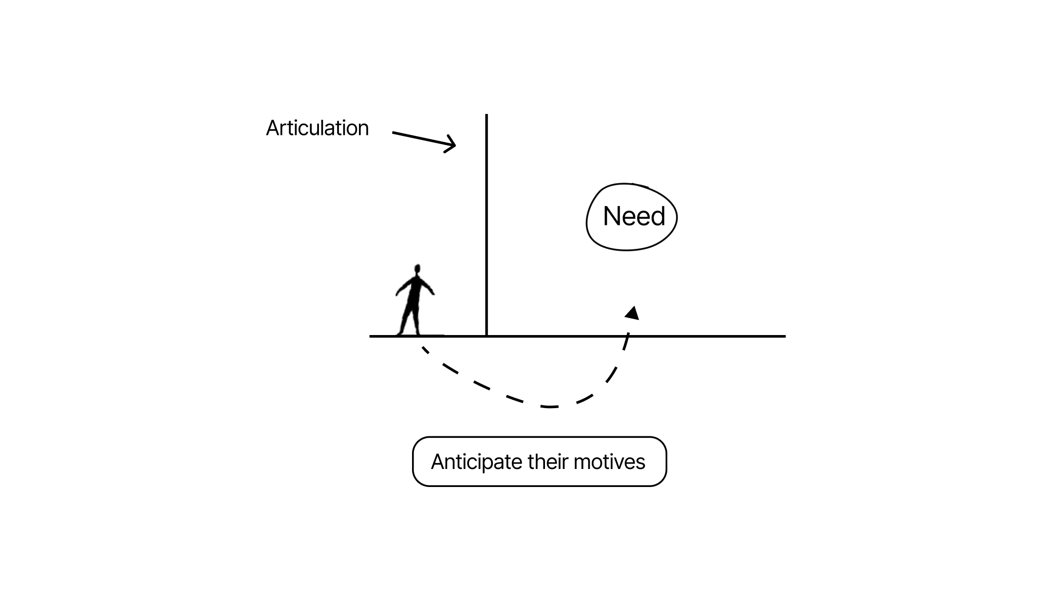
Articulation is a barrier. Humans struggle to articulate their way into what they need. Prompting puts the burden on them. The real opportunity is to identify intent through data and anticipate it in the experience — before the manager knows they need it.

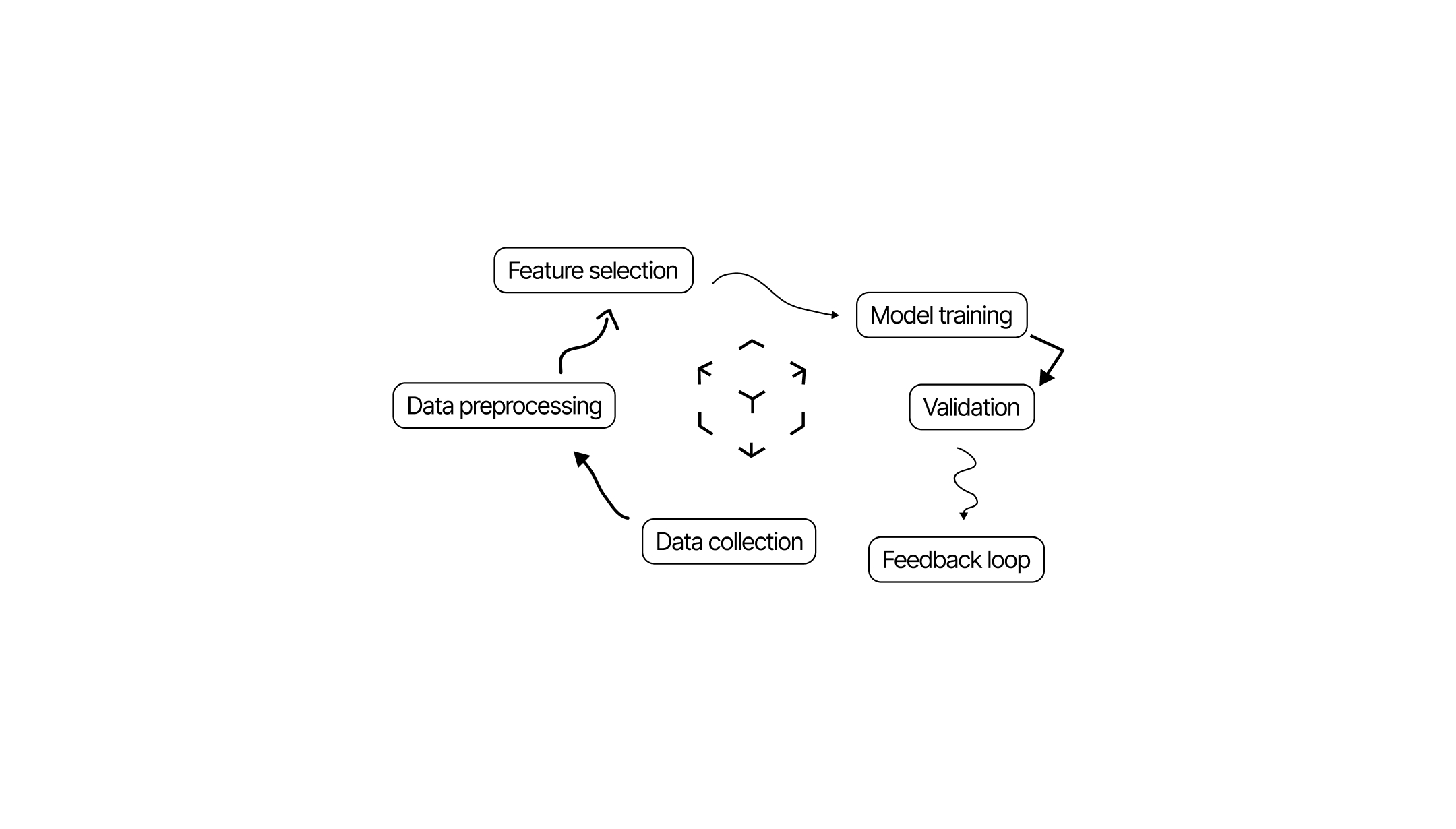
We had data scientists building ML models to forecast time-to-hire — predicting, based on historical patterns, how long it would take to fill a given role. The design challenge was: how do you surface a probabilistic forecast without making the manager feel like the machine is making decisions for them?
We framed the ML output as a signal, not a directive — surfaced as an insight with a recommended action attached. The manager stays in control; the model reduces the cognitive load of figuring out where to start.
The model told us "this role will take 14 weeks." We didn't show "14 weeks." We showed "start this req now to hit your Q3 target." Same data — completely different cognitive frame.
Managers responsible for large orgs had to create dozens of nearly identical job reqs — same team, same level, different cost centers. We built an ML-assisted bulk creation flow that inferred defaults from prior reqs and let managers create at scale in a single session.
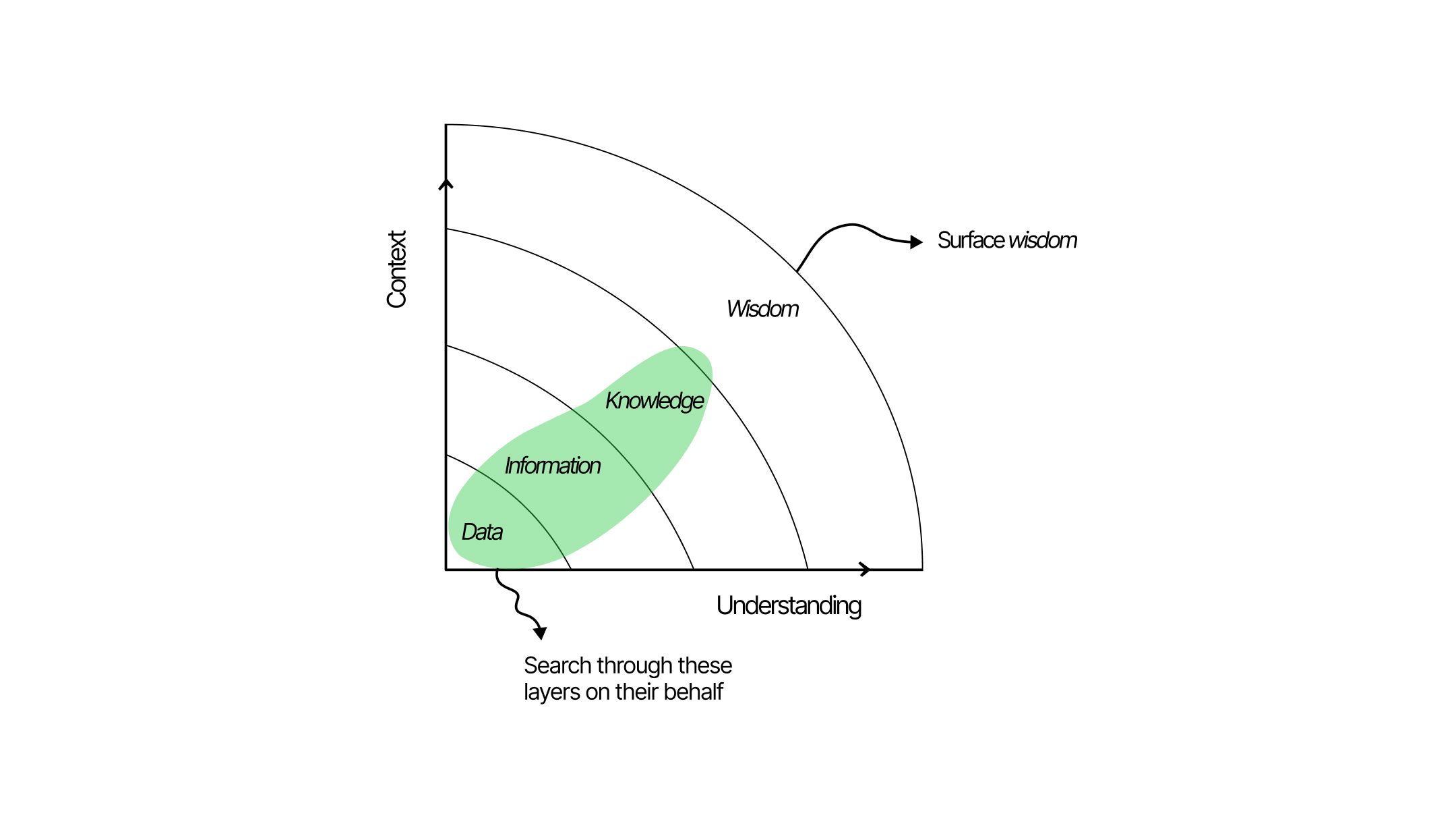
Most navigation problems are actually search problems. And search doesn't have to be an action the human takes — an intelligent experience can surface what they need before they know they need it.
We redesigned Roster's search to function as a decision assistant. Rather than returning a list of matching results, it anticipated the manager's likely intent based on their current context — role, org, open reqs, hiring stage — and surfaced the most relevant information proactively.
It's less of a search bar and more of a decision assistant. The input is still there — but the intelligence leads, not the query.
Roster isn’t a consumer product, but the problem is familiar: help someone find the right thing and act on it without making them hunt. Anticipatory search and next-best-action turned a wall of data into a path. The same thinking applies anywhere people discover and move through a large set of options.
95% of tasks were completed without help. That’s how we knew the overview and the pre-filled form worked before launch.
Before launch, we aligned the team on three specific, measurable criteria for what success looked like. These weren't aspirational — they were commitments.
By the end of 2023, every organization across Amazon and AWS was using Roster. The metric I'm most proud of isn't adoption — it's the 22-minute average. In enterprise software, that means the tool is doing its job well enough that you barely have to be in it.
org adoption — every Amazon + AWS org
reduction in over-hiring across AWS
task success rate in usability testing
Working alongside data scientists, I learned we were speaking different languages — they think in technical intuition, I think in behavior and systems. Diagrams became the bridge. Shared representations of observations, entities, and outcomes unlocked the AI design process.
Search doesn't have to be an action the user takes. An intelligent experience can search on behalf of the user, surfacing what they need before they know they need it. Roster's anticipatory search was the concrete version of that idea.
Prompting puts the cognitive burden on the user. If you can identify their motive through data and anticipate it in the experience — you remove the barrier entirely. That's the design challenge I find most exciting, and the one I keep coming back to.


I'd involve data scientists earlier in the design process — not just at handoff. We lost weeks translating between mental models that could have been aligned in the first sprint.
I'd also push harder for a dedicated mobile experience earlier. Managers checking in during standups and 1:1s were doing it on their phones — but our mobile consideration came late in the process.
And I'd have instrumented design-specific metrics from day one — task completion by feature, not just session time. The 22-minute stat is compelling, but I couldn't always trace it to specific design decisions. That's on me.