Realtor.com helps millions of people find a place to live — but "search" meant something different to every one of them. Someone buying their first home, someone renting across the country, someone just checking what sold down the street: all typing into the same box, all needing something different back. I led the vision for a global search experience that could hold all of those intents at once — and aligned it to the brand pillars that define what Realtor.com promises its users: control and guidance.
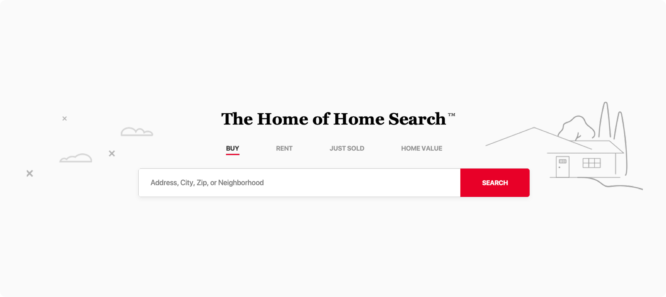
The challenge wasn't building a search bar — it was designing one experience flexible enough to serve a first-time buyer, a cross-country renter, and a curious neighbor without fragmenting into separate products. Working with the team at Huge, I facilitated brand workshops to define what search should feel like, then translated that into a global search vision: a single, adaptable entry point that guides each person toward what they're actually looking for. The walkthrough below shows how it comes together.
Realtor.com's brand was built on four pillars: Control, Guidance, Clarity, and Confidence. My job was to translate those from brand language into interaction decisions. What does "guidance" mean when someone types three letters into a search field? What does "control" mean when the results could be a house, a neighborhood, or a market trend? What makes a result feel clear, and what makes a person feel confident enough to act on it?
I facilitated workshops with the Huge design team to pressure-test every major search decision against those four pillars — turning brand strategy into a working filter for interface choices, not just a slide in a deck.
Every result gives people a clear next move.
The interface leads before the user has to ask.
Results are structured and labeled to be instantly legible.
People can tell they found the right answer, fast.
The search experience needed to serve fundamentally different people without asking them to declare who they were first. A first-time buyer typing a city name has a different journey than someone checking a specific address they already know is sold. Rather than forcing an upfront choice, the design let intent reveal itself — Buy, Rent, Just Sold, and Home Value sitting as parallel paths from the same entry point, so people could self-select without friction.
The result is the search you see in the walkthrough: fast, uncluttered, and built to guide rather than overwhelm — control and guidance, made literal in an interface.