Ten years building design systems for enterprise, fintech, media, and consumer products — the token architecture, governance, and design-to-code pipelines that hold a product together when the teams building it never meet.
Design Systems Architect
UX Design Lead
Token architecture
Governance
Design-to-code
AI-readiness
Warner Bros. Discovery
AWS
GoDaddy
Dell
2017 - present
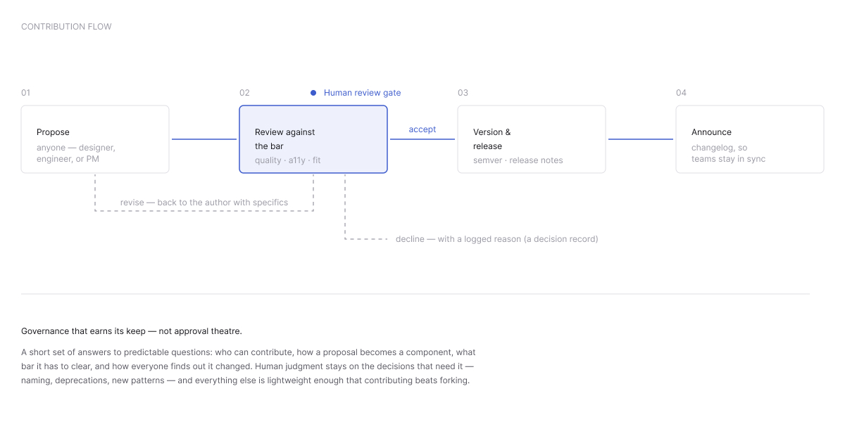
What follows is how that gets built: the foundations that decide whether a product feels considered or assembled, the architecture that lets it scale, the pipeline that keeps Figma and code from drifting apart, and the governance that keeps it alive after launch.
The Warner Bros. Discovery content-sales tool I designed and built — running here on the real Water Tower tokens, with every elevation, radius, and color resolved from a variable rather than a value typed into a mockup. Select a few titles, or open the search bar. Play around with it!
Water Tower — the design system for Warner Bros. Discovery's global content and streaming platforms.
Every system rests on a handful of decisions about color, type, and space. Get them wrong and no amount of governance rescues the result. Get them right and they do quiet work on every screen in the product. This is craft that happens to be systematic.
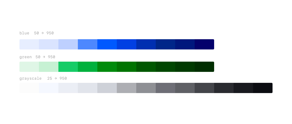
I build ramps in oklch rather than hex or HSL because it’s perceptually uniform: the step from 400 to 500 looks like the same size step on every hue. Ramps stay predictable, themes stay coherent, and contrast becomes something you calculate instead of eyeball.
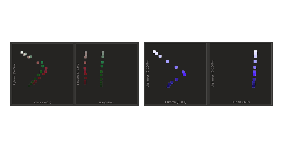
A few ramps up close — the same 50–950 structure across every hue.
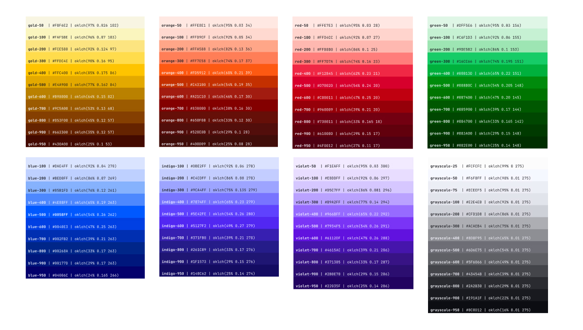
Eight ramps — gold, orange, red, green, blue, indigo, violet, plus grayscale — each a full 50–950 scale with hex and oklch values on every step.
A modular type scale and a spacing system built on one base unit. Every size and every gap resolves to a token, so vertical rhythm survives contact with a dozen product teams working in parallel.
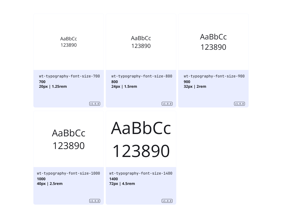
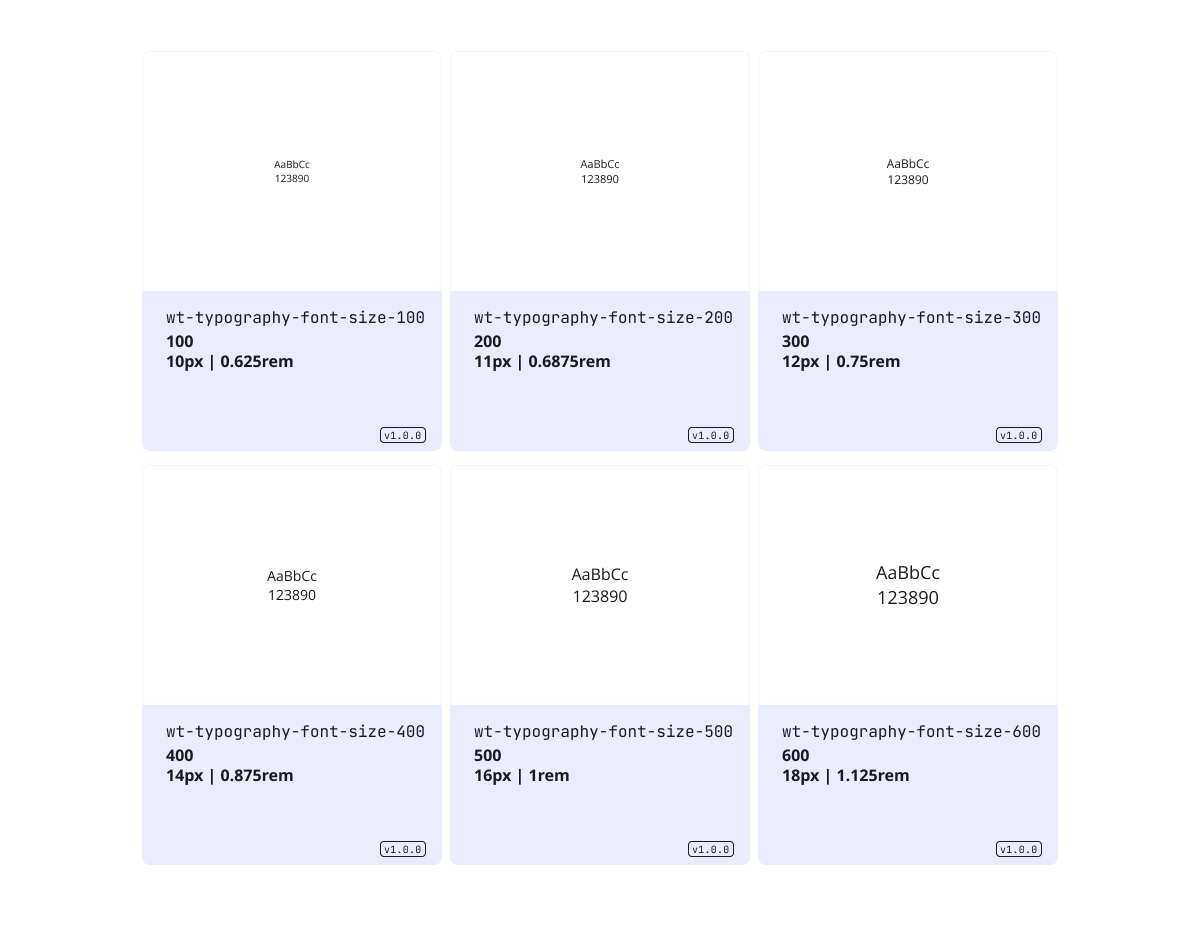
Four families (base, title, display, mono), a full weight range, and a size scale from 10 to 72px — each
step a token in px and rem.
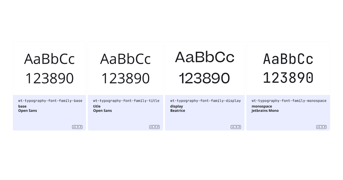
A modular scale from 10 to 72px — every step a token, in px and rem.

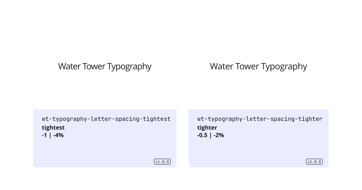
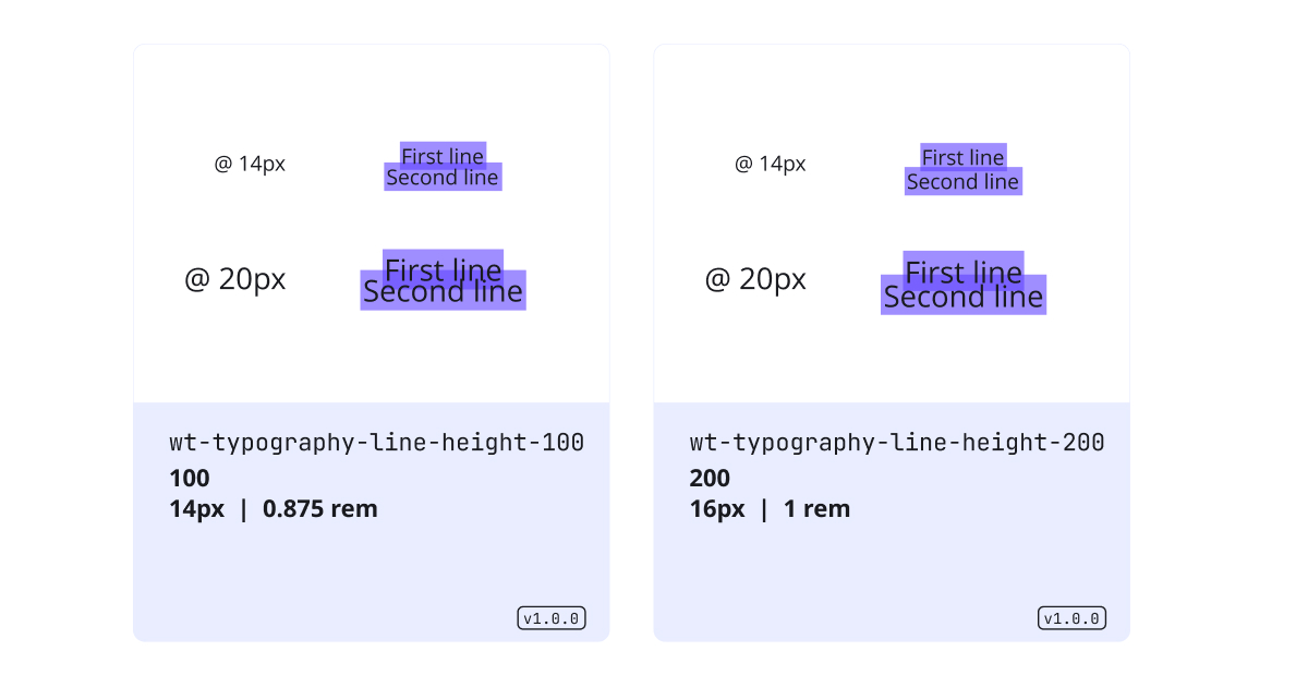
Line-height and letter-spacing, tokenized to the same standard.

One foundation, several expressions — light and dark, plus per-product theming so separate tools in a suite share a backbone without looking identical.
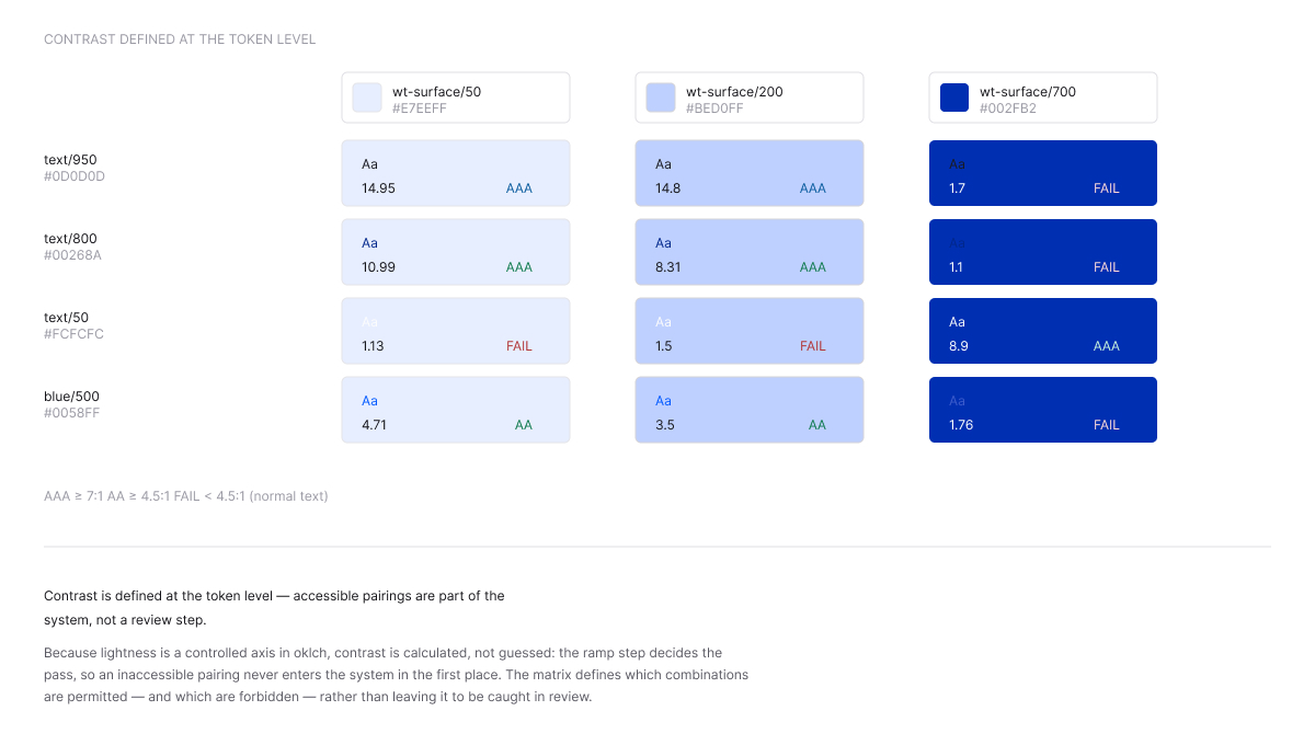
Contrast compliance built into the token pairings rather than caught in review. If a combination isn’t accessible, it isn’t in the system.
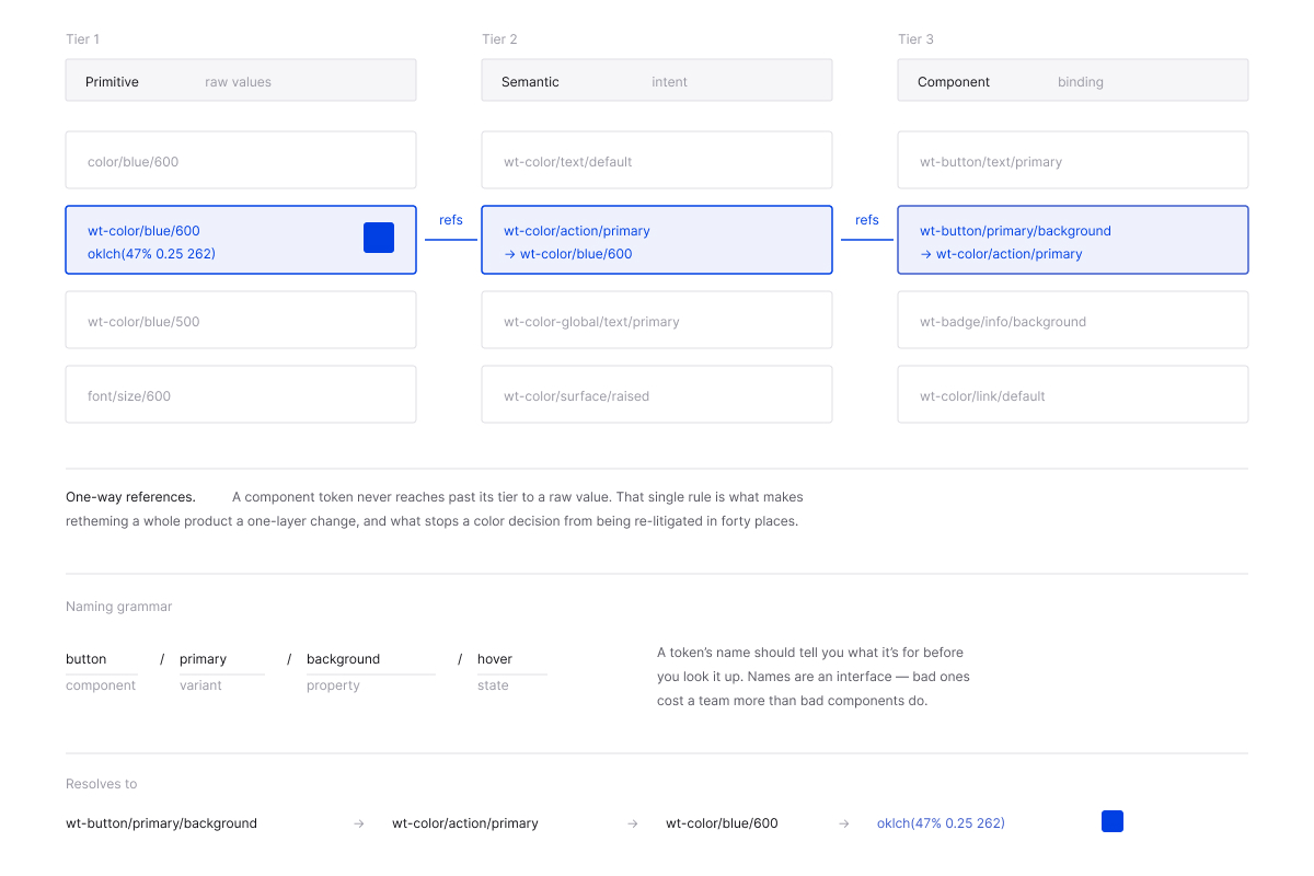
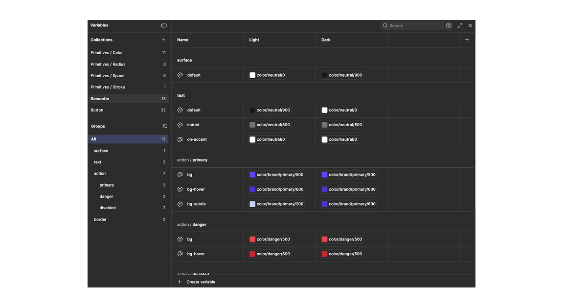
A tiered taxonomy: primitives hold raw values, semantic tokens carry intent, component tokens bind that intent to specific parts. A component never reaches past its own tier to a raw value. That one rule is what lets you retheme an entire product by changing a single layer, and what stops one color decision from being re-litigated in forty places.

A structured grammar — component, variant, property, state — so a token’s name tells you what it’s for before you look it up. Names are an interface. Bad ones cost a team more than bad components do.
Built with variants, auto-layout, and documented states from the start, then published as versioned shared libraries — so consuming teams pull from something predictable instead of copying it and quietly diverging.

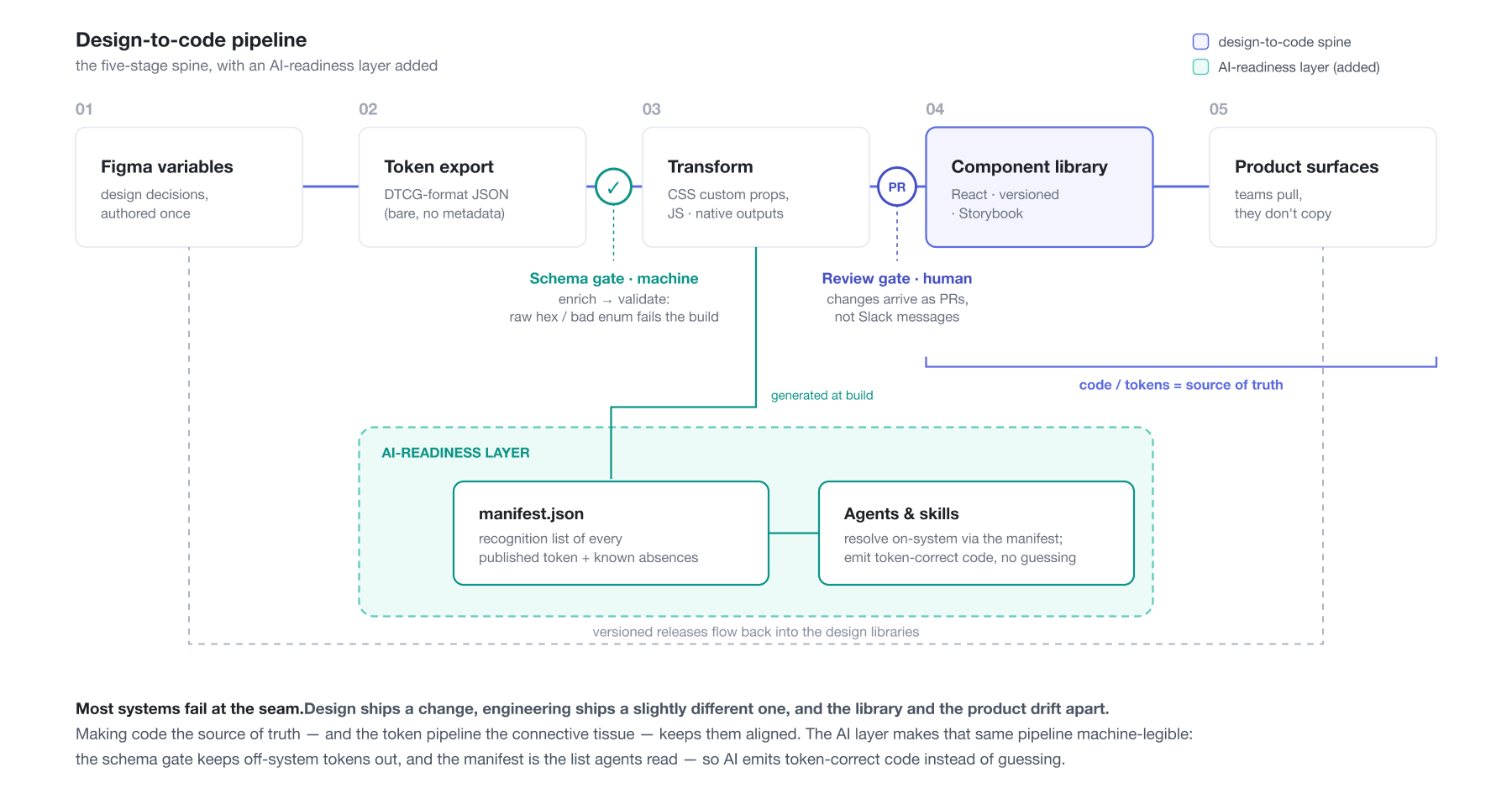
Design and engineering come apart at the handoff, not the kickoff. The fix isn’t more documentation — it’s making the token pipeline the only path between the two, so changing a value in Figma arrives in the component library as a reviewable pull request rather than a message someone has to remember to act on.
At Warner Bros. Discovery, laying that groundwork for tokenized components in Storybook increased developer story-build efficiency by 50%.
See a prototype I built hands-on →

Governance has a bad name because it’s usually approval theatre. The useful kind is a short set of answers to predictable questions: who can contribute, how a proposal becomes a component, what bar it has to clear, and how everyone finds out it changed.
I define those, then spend most of the effort on adoption — documentation, office hours, and building alongside product teams instead of gatekeeping them. A system nobody adopts is just a very tidy Figma file.

The next constraint on design systems isn’t human adoption — it’s machine legibility. Teams are pointing AI tooling at their systems and getting back output that looks plausible and quietly invents components that don’t exist. That isn’t a model problem. It’s a documentation problem: prose, screenshots, and implied rules are unreadable as constraints.
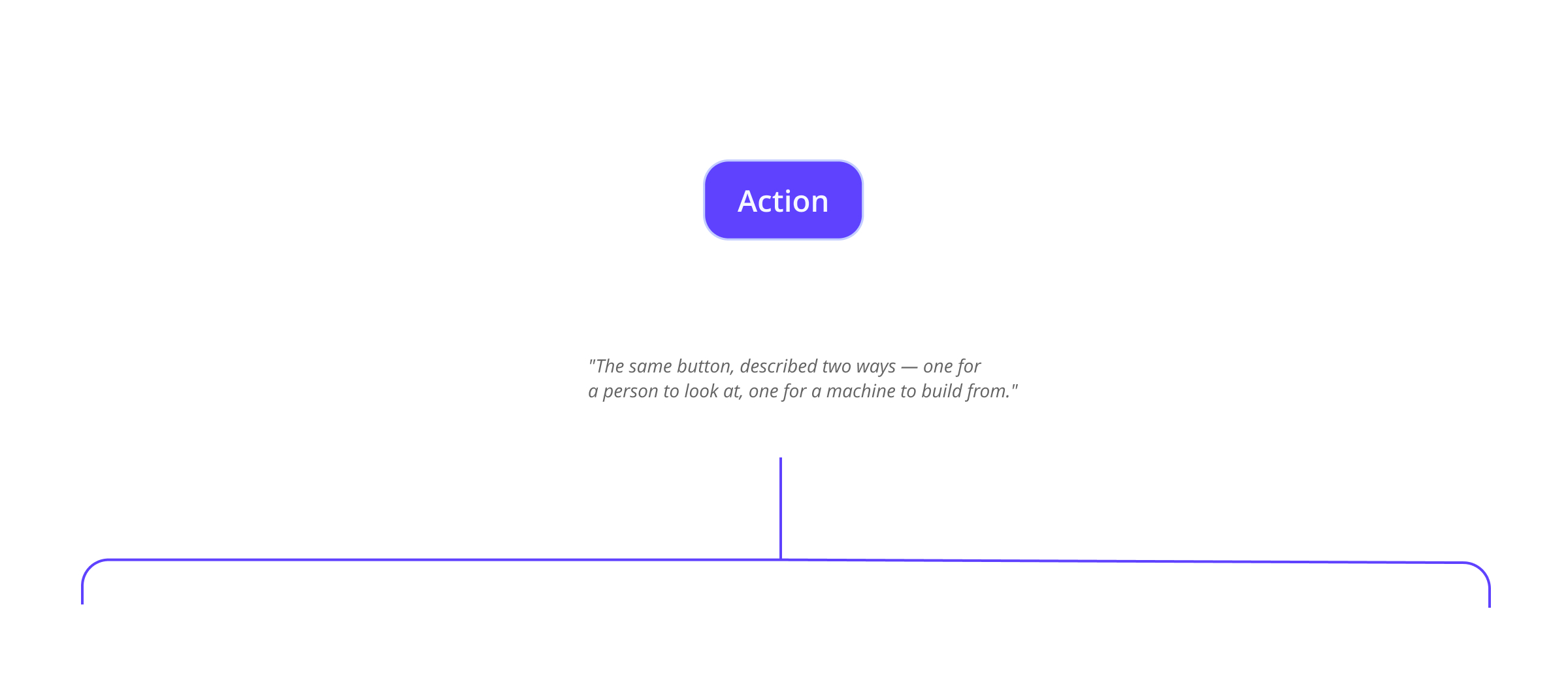
So I’ve been structuring token taxonomies and component documentation as machine-readable contracts — explicit schemas and metadata rather than narrative — so the same source that guides a designer can constrain a model. This is a developed point of view and a working approach rather than a shipped platform, pressure-tested daily against agentic tooling: Claude Code, Cursor, Figma MCP.
It’s the part of the practice I’m most interested in, and I think it’s where systems work is heading.

{
"button": {
"primary": {
"bg": {
"$type": "color",
"$value": "wt-action-primary-bg",
"$description": "Background for the primary (filled) button — the default, highest-emphasis call to action."
},
"bg-hover": {
"$type": "color",
"$value": "wt-action-primary-bg-hover",
"$description": "Primary button background on hover."
},
"label": {
"$type": "color",
"$value": "wt-text-on-accent",
"$description": "Label color intended for use on the primary accent background; pairing is contrast-checked at the semantic layer."
},
"border-color": {
"$type": "color",
"$value": "wt-action-primary-bg",
"$description": "Border matches the fill so the primary button reads as a solid shape."
},
"border-width": {
"$type": "dimension",
"$value": "wt-stroke-width-0",
"$description": "Primary button is borderless (filled)."
}
},Water Tower is the system I built from nothing, and most of what’s above comes from it. These are the others — some I architected, some I extended, some I built for clients under someone else’s brand.
Architected the foundation for a suite of internal tools: token taxonomy, naming grammar, component libraries, theming, and documentation, with a token-to-Storybook pipeline underneath. Architected and piloted across multiple products, with adoption driven through documentation and hands-on partnership.
+50% developer story-build efficiency
Worked with the central design-system team to document interaction models, component patterns, accessibility guidelines, and usage standards — the connective work that drives adoption across teams who’ll never meet. Expanded the Figma system with interactive components and documentation alongside the UX Core team — working inside existing architecture and constraints rather than starting clean. Architected the foundation for a suite of internal tools: token taxonomy, naming grammar, component libraries, theming, and documentation, with a token-to-Storybook pipeline underneath. Architected and piloted across multiple products, with adoption driven through documentation and hands-on partnership.
Expanded the Figma system with interactive components and documentation alongside the UX Core team — working inside existing architecture and constraints rather than starting clean. Architected the foundation for a suite of internal tools: token taxonomy, naming grammar, component libraries, theming, and documentation, with a token-to-Storybook pipeline underneath. Architected and piloted across multiple products, with adoption driven through documentation and hands-on partnership.
+20% development speed · +15% UX
Enhanced the enterprise design system and its guidelines, then led the redesign of transactional experiences built on top of it.
+25% consistency · +20% UX metrics
Built design systems for Verizon, Red Bull, and WeWork while owning the client relationships and leading a team of four to eight designers. The practice starts here.
Self-directed work — where I think the practice goes next.
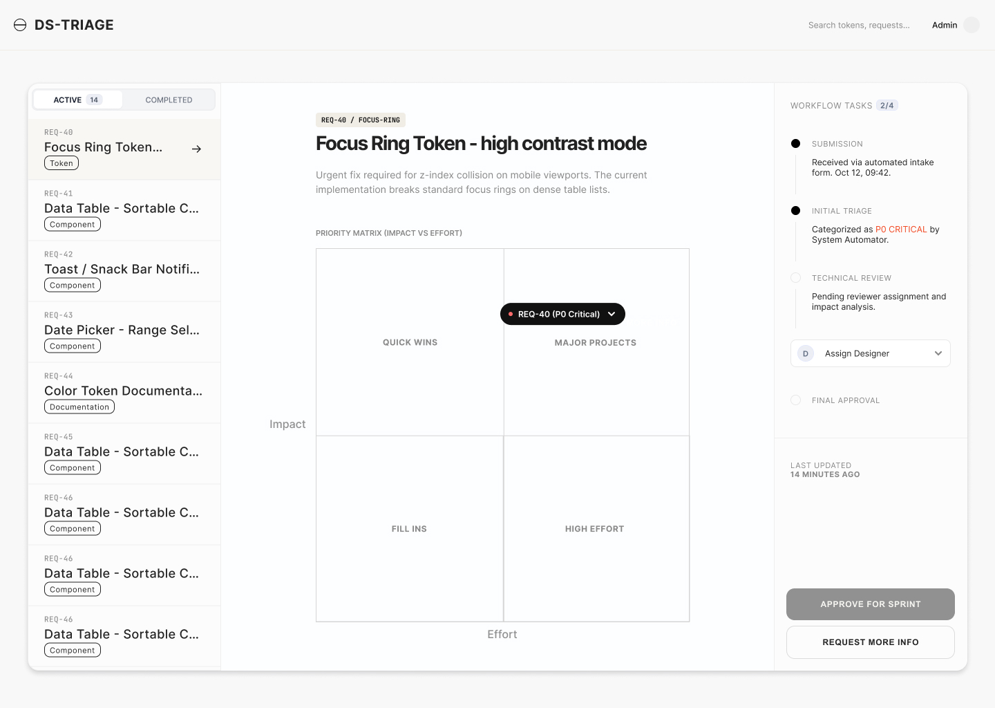
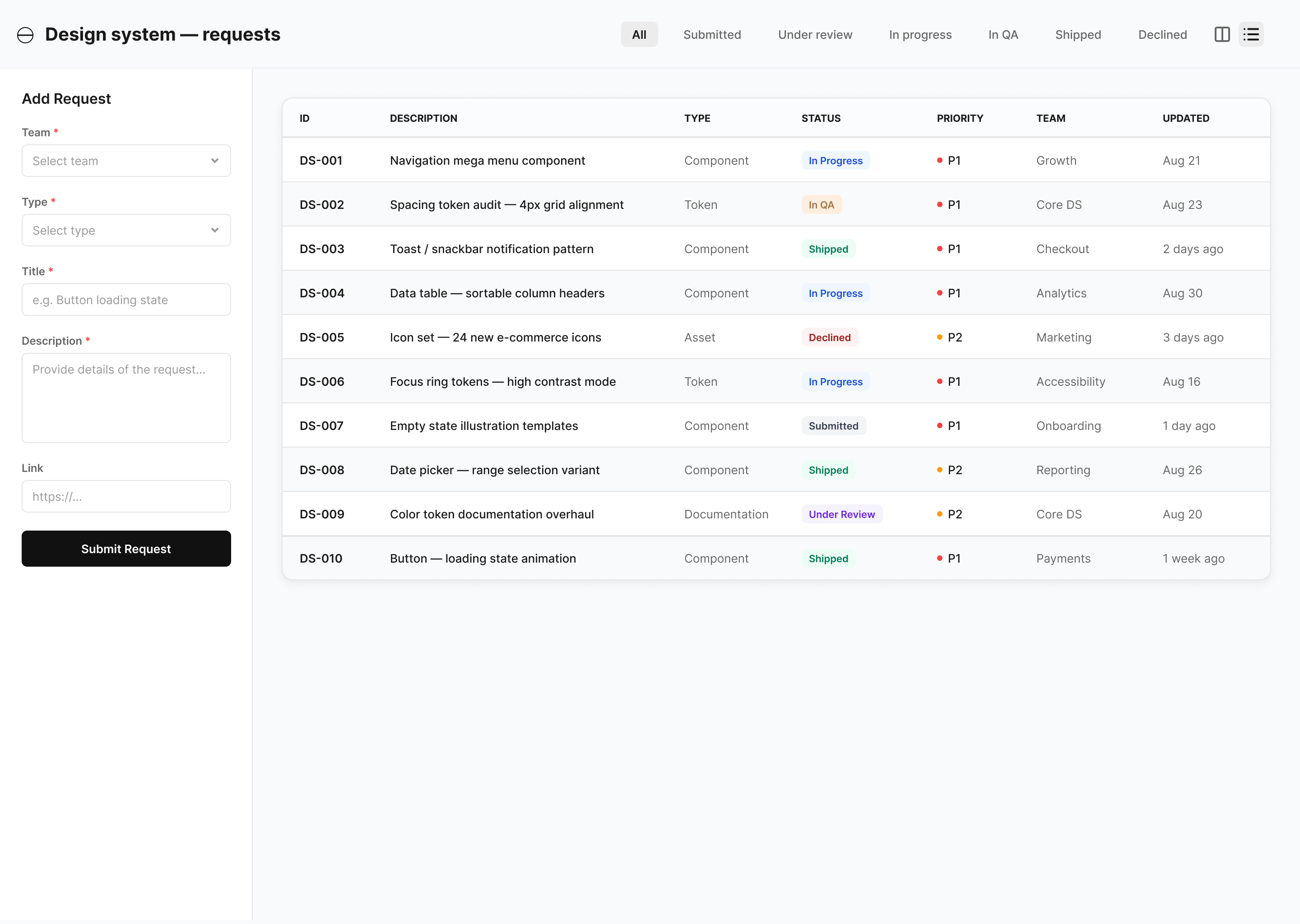
What governance looks like when request volume outgrows the maintainer: automated intake, auto-triage to priority by a rules layer, an impact-versus-effort matrix, and a human approval gate before anything reaches a sprint.